

Dashboard lets you select how you want the graphical information to be displayed. These graphical controls let you select such options as whether you want your information displayed as a pie chart or as a bar chart, whether you want to expand or collapse the viewed report, whether you want to refresh the data being displayed, and what to do with the collected data.
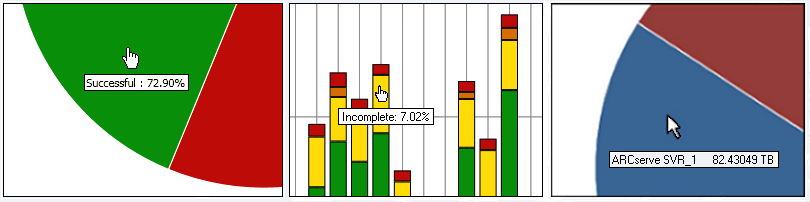
A pie chart is a circular chart divided into a series of sectors, with each sector representing a relative percent of the total categories being monitored. Together, the sectors represent a full 100% of the monitored information. The advantage of pie charts is that they are simple. Pie charts provide you with an aggregate view over a period of time. However, a disadvantage is that it can be very difficult to see the difference in slice sizes when their values are similar.
Bar charts are used to highlight separate quantities. The greater the length of the bars, the greater the value. Bar charts are useful for comparing quantities within or among categories. For some reports, bar charts provide you with a daily view over a period of time, which can help in identifying trends/patterns. You might find it difficult to compare segments from a pie chart; however, in a bar chart, these segments become bars which are much easier to make comparisons.
Line charts are used to show trends over time by connecting a series of data points together with a line.
Tabular charts are used to display report information in a table format. The column headings may vary between different reports and also may vary within a specific report between selected report categories. Table views allow you to sort the report information based upon a specific column heading.
For any of these graphical displays, when you hover the mouse cursor over a particular category of a report, a small box appears under the cursor displaying the category and its corresponding value.
If the cursor is a pointing hand symbol, it is an indication that the corresponding area is "clickable" and can display additional information about that category when clicked. If the cursor is an arrow symbol, it is an indication that the corresponding area is not "clickable" and no additional information is available.
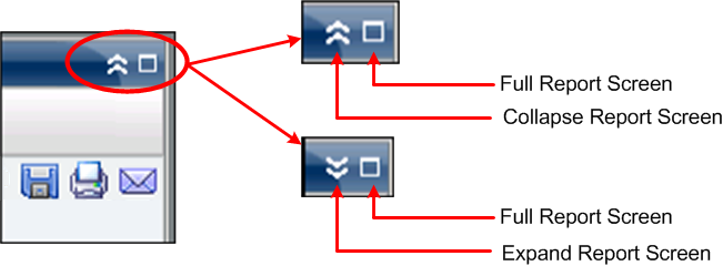
All reports let you select how they are displayed. From the overall display, you can collapse an individual report if you do not want to view the report details, and then expand it back to its original size. (When a report is collapsed it only displays the title bar and description bar). In addition, you can also select to fully expand the report to a full screen view. You can also double click on the title bar of a report to maximize it or bring it back to default view.
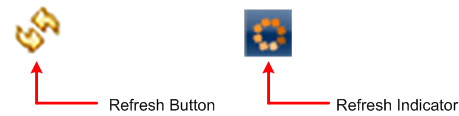
All reports let you refresh or reload the data to be displayed on the corresponding report. Each report has a refresh button that updates the display for the corresponding report to let you view up-to-date information about your backup/SRM environment. A refresh indicator provides a visual indication that the displayed data is being refreshed. Although Dashboard does not provide an option to automatically refresh reports after every few seconds, you can click Refresh All in global toolbar to refresh all the Dashboard reports at once. In addition, when you switch from one report (report A) to another (report B), report B is automatically refreshed.
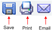
All reports let you export collected data for the corresponding report. For each report you can specify if you want to print the collected data, save it as a Comma-Separated Values (CSV) file to store the tabular data (to be used in a spreadsheet), or email the report through a SMTP server.
Note: Before any email can be sent out (either from the GUI or scheduled), you must first configure the SMTP setting using the Alert Manager. For more information, see the Administration Guide.
Note: Microsoft Excel does not always render multi-byte characters properly.
For any drill-down report that contains more than 100 message entries, Dashboard automatically paginates the display and includes a next page button. Each subsequent page is then limited to 100 entries before creating another page. The next page button lets you jump to view a different page.
![]()
|
Copyright © 2017
|
|